West Bromwich Albion
How do you put the bounce back into the WBA football brand?
HDY were tasked with helping West Bromwich Albion to rebuild a brand identity that could carry the club forward for years to come. Every football club has a past and a future. Refreshing the WBA brand was about linking the two by celebrating the rich heritage, while also looking forward with excitement.
That’s why we helped to create a brand identity born from the lived identity of its people. Through connecting the generations past to the future ones taking the club forward, we ensured the fans were at the heart of the brand.
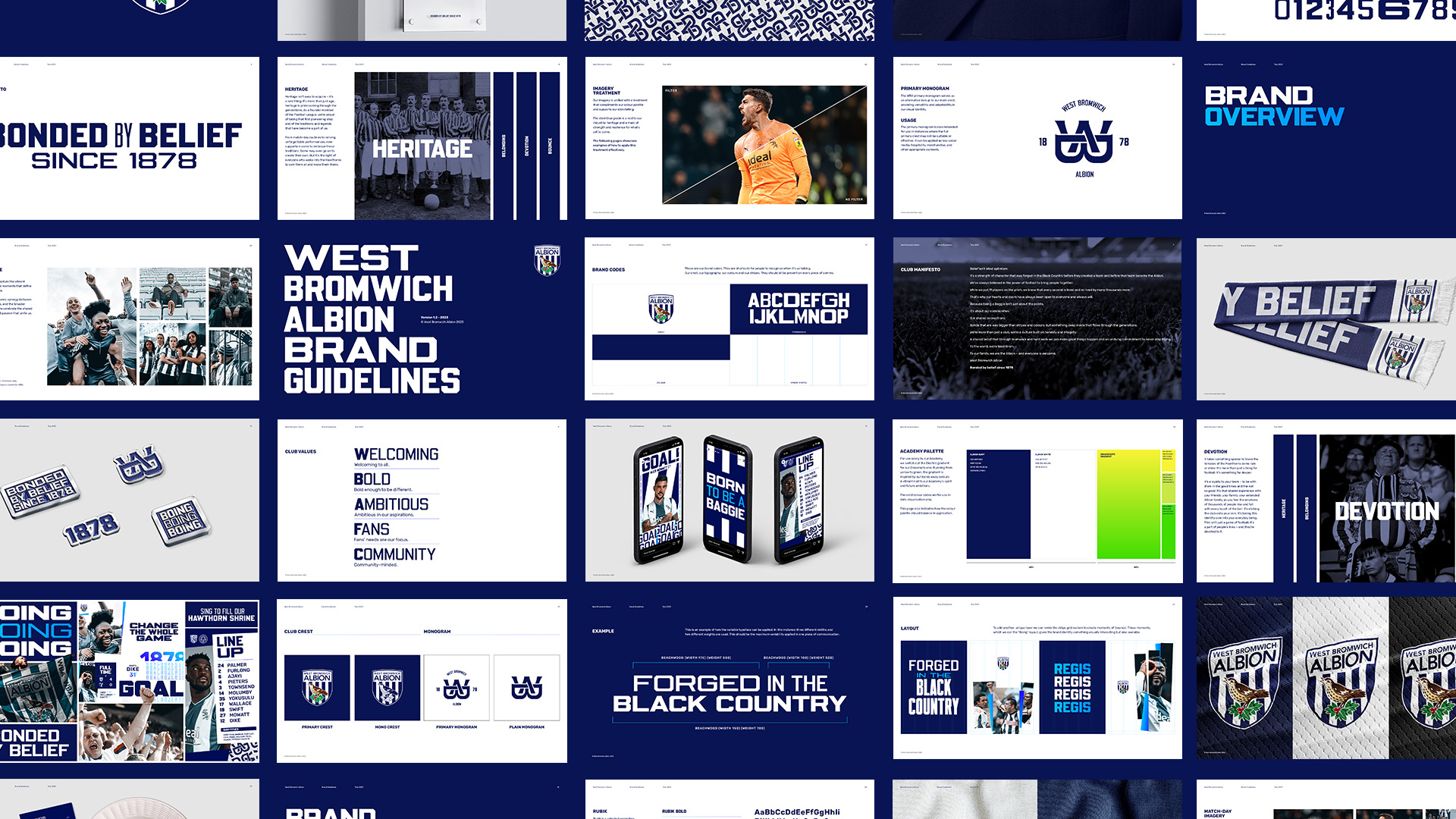
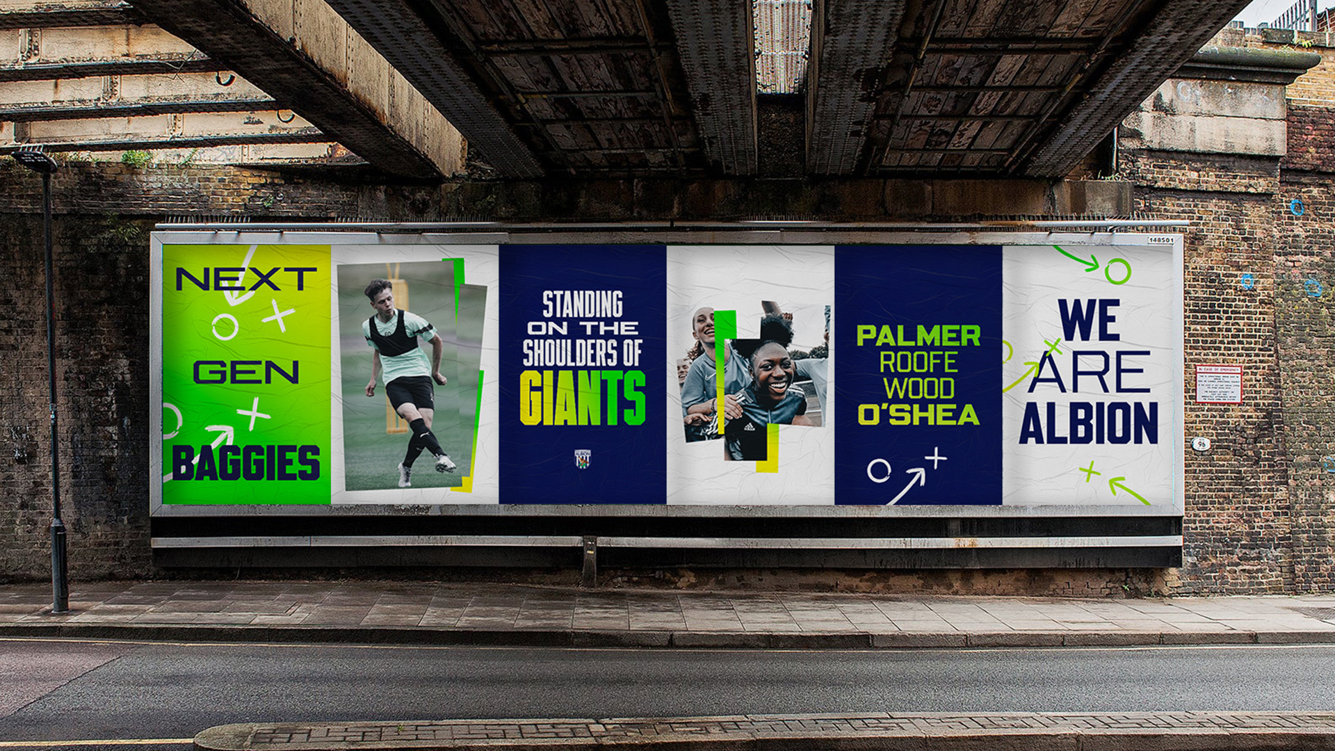
We set out to distinguish the 4 key pillars of the brand, create a new club motto, produce a manifesto type film, and generate a new design system inclusive of typography, monogram and brand book. Take a look below to see the final results.
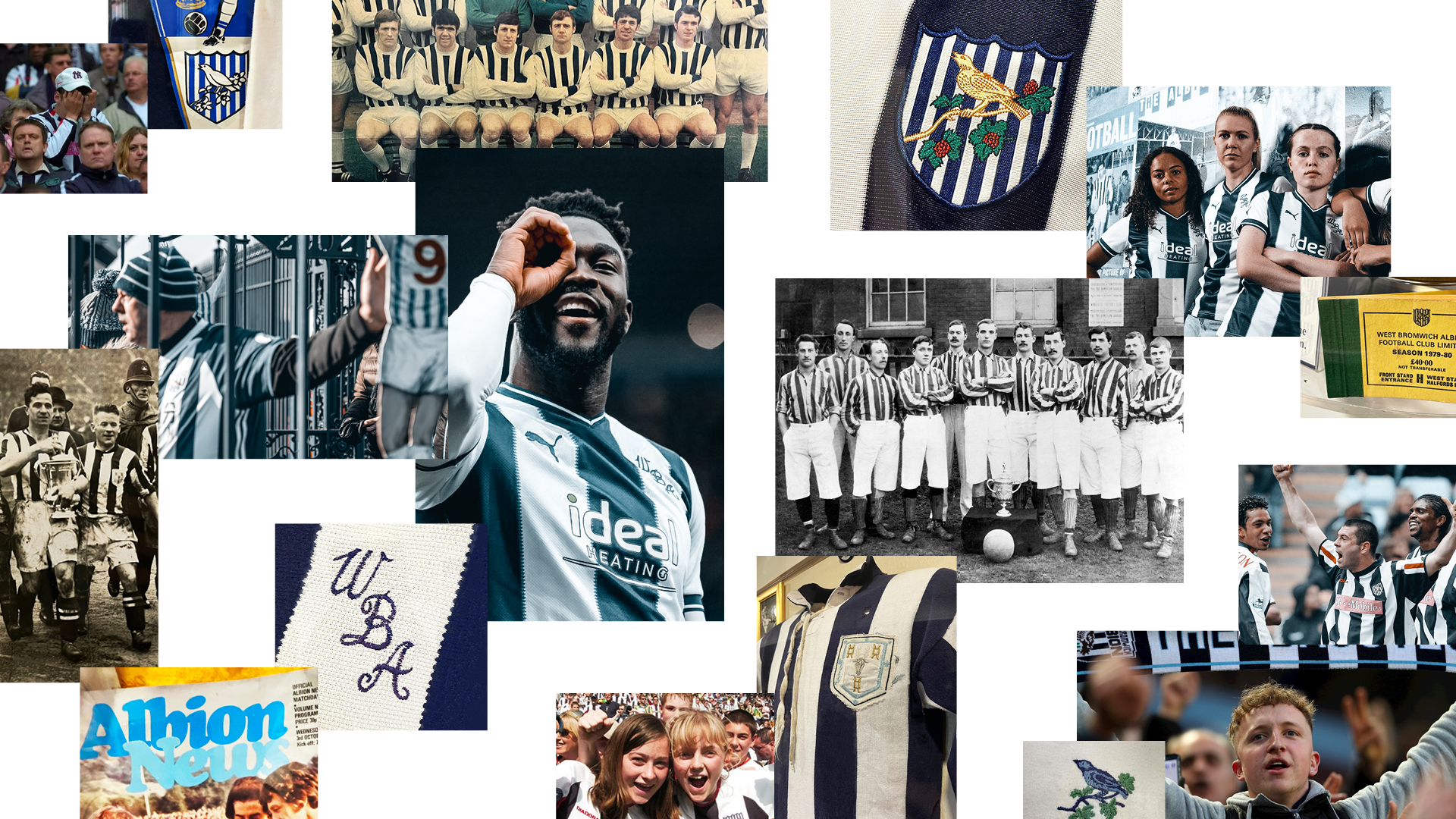
Learning the club stripes.
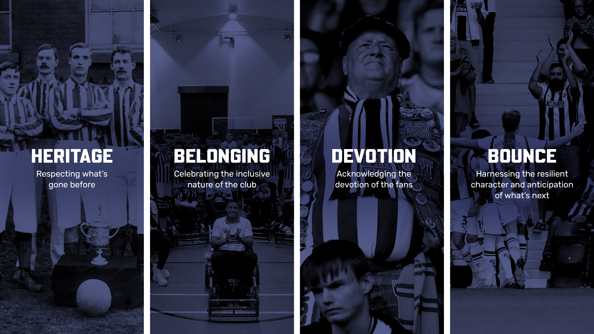
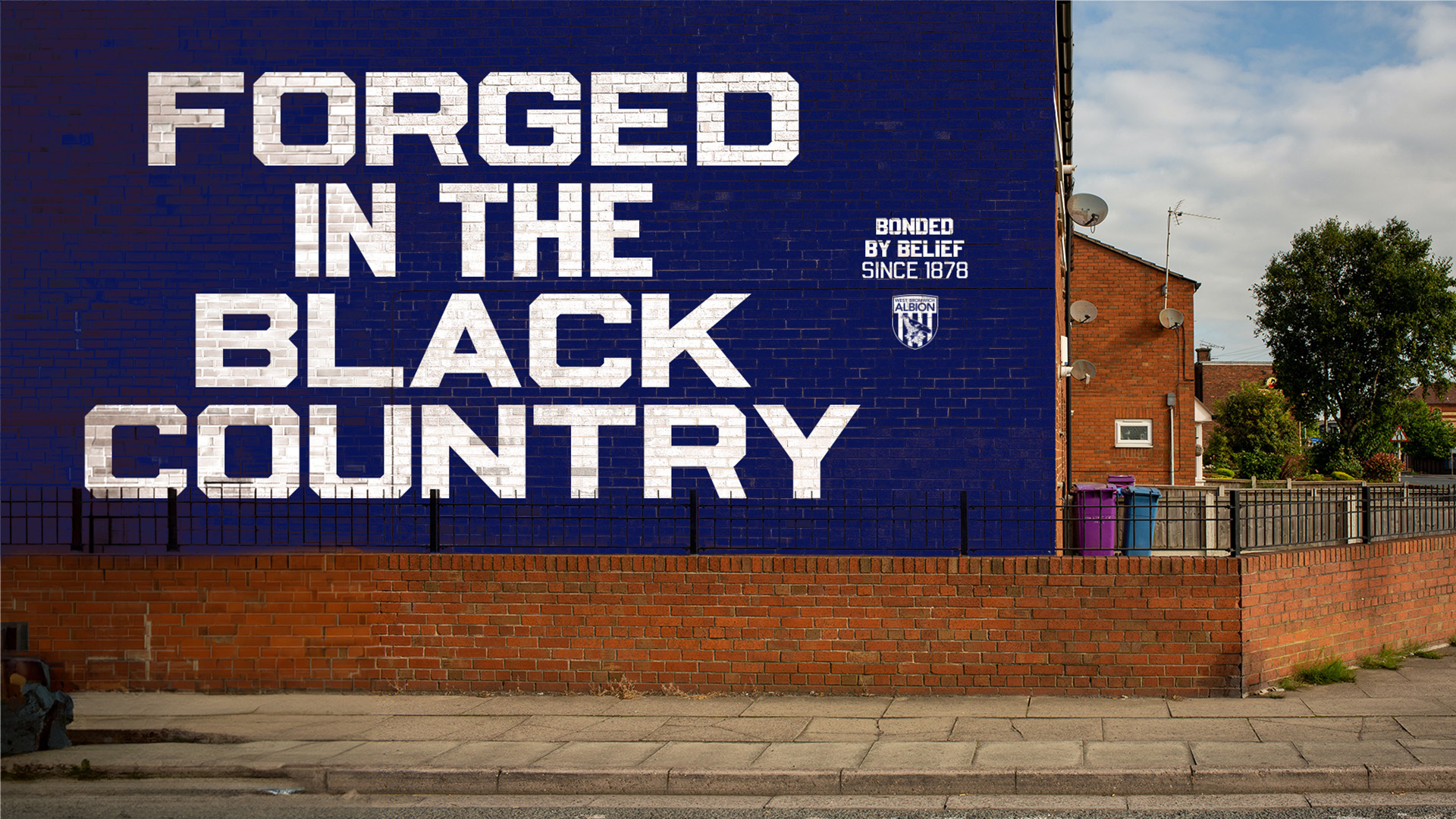
The Albion is about more than football. WBA is a global community forged in the Black Country on hard graft and strong values. That’s why we distilled the club down into four layers – or ‘stripes’ – to help forge the new identity.
This creative journey provided us with rich playgrounds we could explore and grow from.
Heritage, Belonging, Devotion and Bounce.
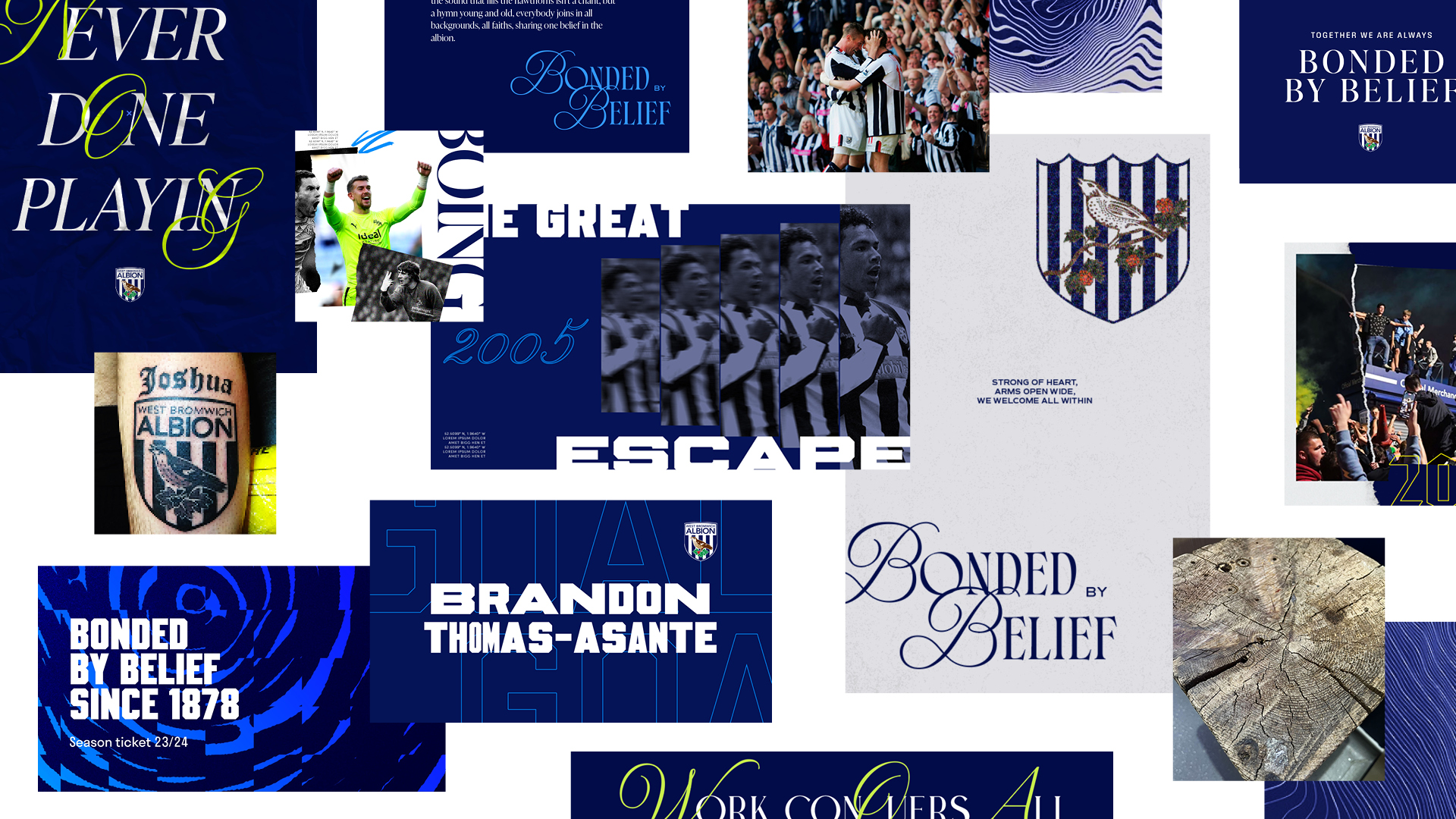
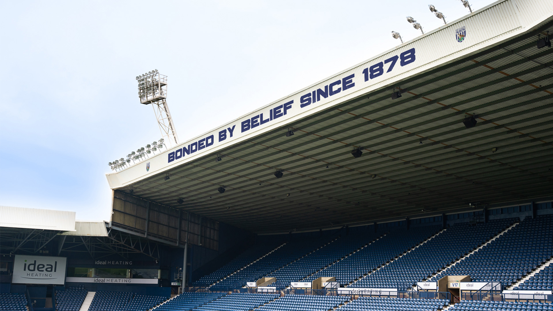
Bonded by belief.
Did you know? West Bromwich Albion, one of the first members of the football league, were founded before they even owned a ball. Such was the belief in what they could achieve together and that sense-of-self has continued throughout the last 145 years.
That’s why the new club motto is from and of the fans, thus encapsulating the essence of who WBA are. By putting its origins at the heart of the club and creating a unifying mantra, the WBA identity can transcend geographic and demographic barriers.
Quite uniquely the most famous WBA song heard at games is actually the first verse of a Psalm, ‘The Lord is My Shepherd’. We wrote new verses to articulate the motto and created a manifesto type film to launch it to the world.
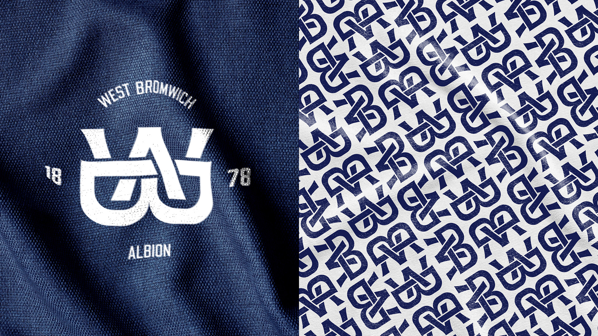
Design System & Typography
The design system is based on the five stripes from the club crest. By using them to form a grid, flexible consistency can occur across all media. As a result, a distinctive asset can remain at the centre of the branding at all times.
The WBA typography is instilled with meaning because fans are as outspoken as they are inclusive. Therefore, the verbal side of the brand holds a lot of significance to the club.
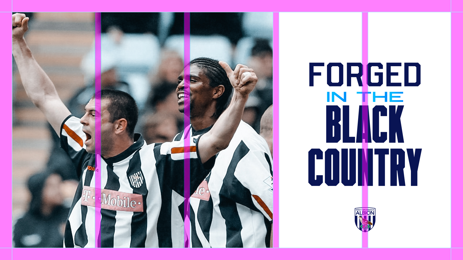
We chose a variable typeface to give energy and emphasis to the words the club uses. Inspired by kit numbers throughout the years and the industrial origins, we selected Beechwood for its characteristics, impact and attitude.
The iconic navy and white club colours form the core palette with the addition of an ‘electric blue’ gradient that cuts through and disrupts visuals. An ever present visual cue for the emotions of football.
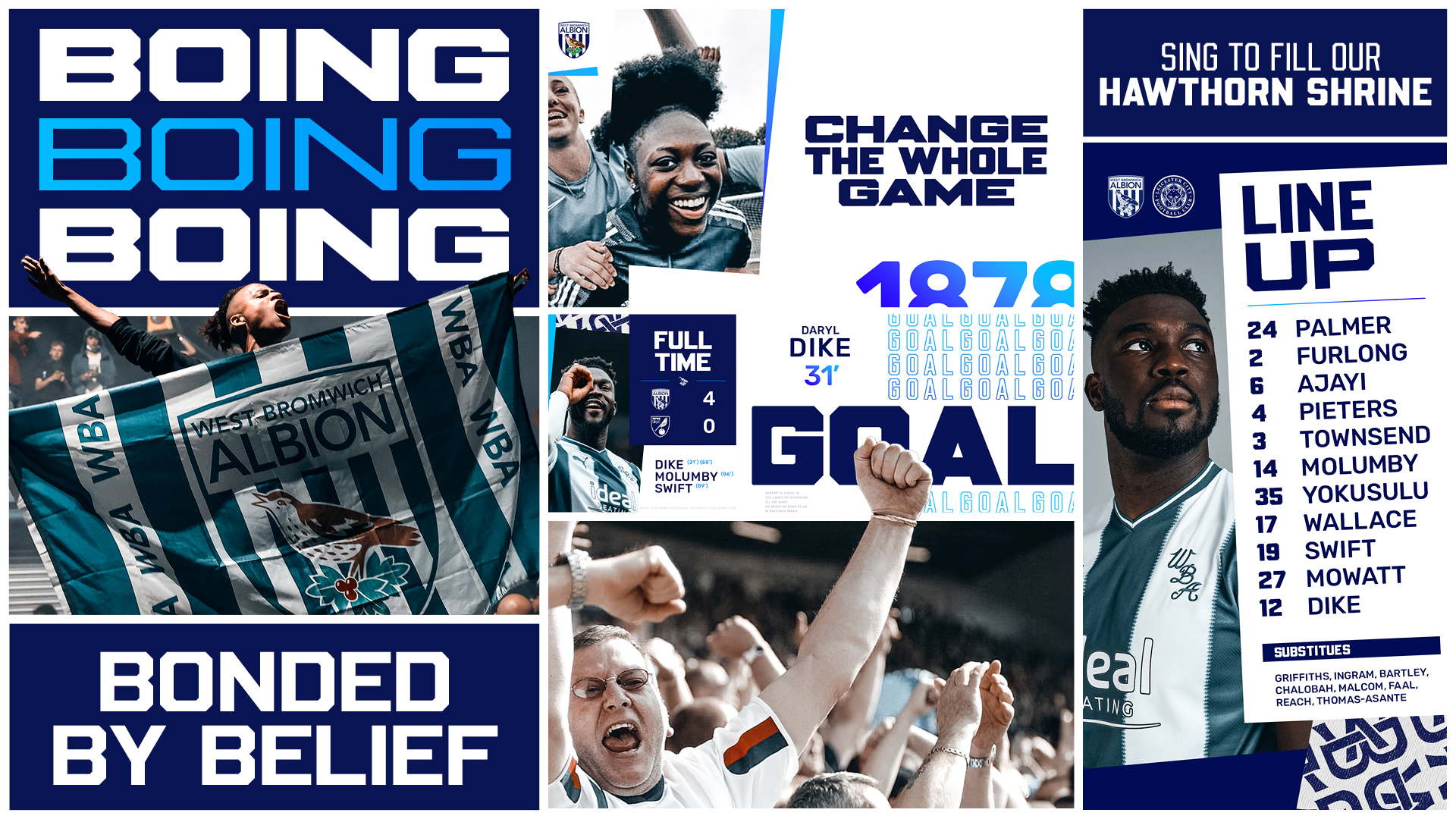
We used one of the fan’s famous chants to create a design system remix. The ‘boing’ brings a sense of playfulness and energy to the identity as well as being a visual signature for the brand.
Football brands live as much online as they do on-the-pitch. So, we created motion principles that bring ‘bonded’ and ‘boing’ together in the same space, resulting in a unique combination that captures the spirit of WBA.
Alongside this, a new monogram was also created to elevate the branding in premium touchpoints. Used in isolation or to form a pattern, the monogram adds another distinctive asset to use when the crest isn’t appropriate.
The book of belief.
To bring all of these elements together in one place, we developed a brand book. A set of principles for the WBA team and partners to express the new identity across a multitude of applications and media. Making sure the brand is distinctive and authentic for years to come.